[QoL Suggestion] Packing Station Storage accessiblity with just one click
-
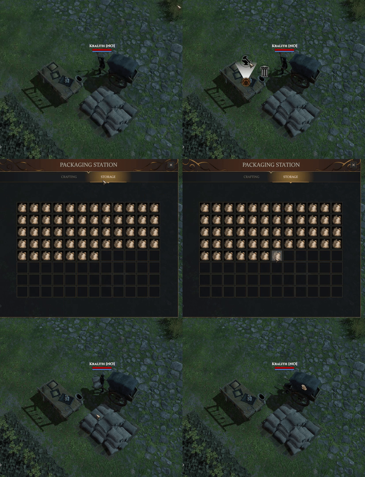
Since the Packing Station Storage is quite big and the Wagon can hold up to 30 items, it is at the moment a real pain to move sacks from station to the wagon.
You need 5 clicks at the moment for picking up each sack and droping it to the wagon.

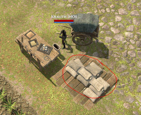
I suggest to make the Station Storage clickable like the Storage in the Carpenter Shop.
Storage Click Area like this:

-
+1000. It may not seem like it wastes much time, but over the course of 30 things it can add a significant amount of time. I noticed a striking difference between how charcoal piles quickly get loaded when compared to packing stations.
-
Yes! This! Please! Thank you!
-
No please. U can't feel the game if everything will automatic? How its automatic? Maybe make rocks and logs also jump automatically in your cart? Maybe killing mobs will be automatically? NO NO NO
-
Even better make these things all work similarly to upkeep or trading post where being on a horse with a cart lets you grab 1-30 all at once to put in or take out.
-
@boogis I didn‘t say anything about automatic. I just pointed out other storages, that open with one click. With my suggestion you just spare 2 clicks, as other storages too.
I am also against automation, just to say.
-
There's a pretty substantial difference between automatic and still having to click. By that same argument charcoal piles should be changed to add a few extra clicks. This QoL improvement wouldn't change anything about still having to produce the components or make the sacks. Would just eliminate what amount to a few pointless clicks.
-
I'm a big fan of quality of life options. I'd like one click to move as much as I set on anything in any container. I'd also like all the items to stack into one slot and add the number to indicate the amount so I don't have to scroll through tons of screens.
-
I'm actually with boogie on this one.
In fact, I'd be fine with them adding a couple clicks to the Charcoal pile.
Why be in such a hurry for everything. You want the game to take some time to do, it's a game, some QoL upgrades are great, but some take away from the game and my preference is to see more things take a few more seconds to do.
-
@GamerSeuss said in [QoL Suggestion] Packing Station Storage accessiblity with just one click:
Why be in such a hurry for everything.
Ohhh you guessed very wrong, i am quite opposite of being in hurry.
But i see it also from a roleplaying view of things, why i need to "search" the table first, if the sacks laying open on a palett? It would make way more sense, even to be able to pick up it with one click.
But i not even suggested to take the sack with one click, i said, make the Storage accessible with one click.
Why this Sacks should be get treated different than wood logs in the Carpenter Storage?
-
You think a few clicks to slow people down is a good thing? I think its immersion breaking. When its time to single click it i pick up my phone to check texts or facebook or game notifications and wish what I was doing was over. There is no sense of achivement. There is no meaningful progression. Its just busy work like im back in elementary school. I hated it then and I hate it now.
-
@AlejoTheBear i think its opposite. more clicks more immersion
-
ooof, i don't know what to say even

-
@Shivashanti why? in fact clicks in game is a definition of person playing. no clicks no play
-
This is a good QoL suggestion that doesn't break immersion at all. It's not "automating" things, it's accessing another location in the building to get to the storage. Instead of being tabs, it'll work like two individual stations/containers.
-
realistically, it would make more sense (to me personally) to have a silo where sacks could be stored and the upkeep would be automatically deducted, instead of making sacks of stuff, putting them in a cart, and bringing them to the town hall.
@Kralith is just pointing out a problem with the default setting for 'open this unit' that adds unnecessary clicks to an already tedious process. Not saying piling grain into my wagon shouldn't be tedious at all (that's realistic!). Just saying it shouldn't be unrealistically, needlessly tedious.
-
@PeachMcD said in [QoL Suggestion] Packing Station Storage accessiblity with just one click:
ting out a problem with the default setting for 'open this unit' that adds unnecessary clicks to an already tedious process. Not saying pilin
Totally agree with both you and @Kralith
 The packaging center could be done better, and I also think that the window should stay open like our Inventory and Chests do when we access them, why should we have to constantly go back to opening it after we already have?
-
@Ostaff said
" I also think that the window should stay open like our Inventory and Chests do when we access them, why should we have to constantly go back to opening it after we already have?"#THIS
Thank you.
-
+1 to this suggestion. I don't mind loading the packs one by one going from the Storage to my cart, that's a little tedious but still fine, however having the menu default opening to the Crafting package tab instead of the Storage tab is quite frustrating, especially if I am already having to load a full cart of grain/protein packs individually.
If it somehow opened the other way around, opening default to the Storage tab and then you have to click the Crafting Package menu to craft packs, that would be quite a bit less frustrating. Or perhaps maybe if you click the part where the packs are visually stored then it opens the Storage tab, and clicking the actual Table opens the Crafting menu? If that is easier to implement it may also be a good solution in my opinion.
-
#freetheclicks
