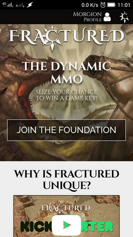
Wow, a redesigned main page!
-
Looks good!

(my first thought was, dang I screwed something up again...)
Also, account guard, nice!
-
Yep. Very nice. Also the KS pledges got integrated!
-
@needlehawk said in Wow, a redesigned main page!:
Yep. Very nice. Also the KS pledges got integrated!
Missed that

-
I honestly didn't notice til I saw this post, because I always just straight to the Foundation page.
-
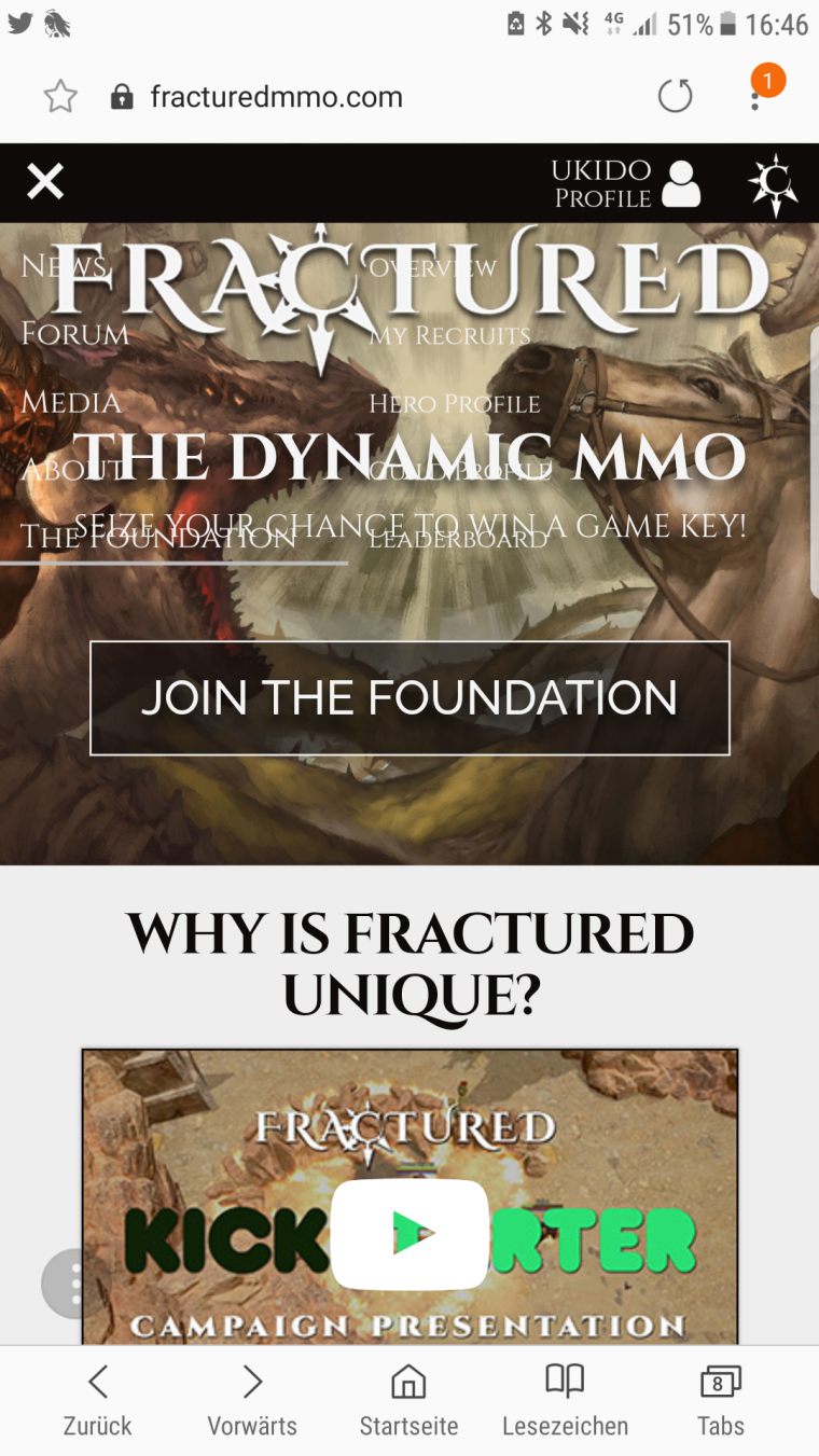
Got problems with the new nav section. Is it only in mobile ? Nearly invisible nav Buttons over banner
-
@ukido said in Wow, a redesigned main page!:
Got problems with the new nav section. Is it only in mobile ? Nearly invisible nav Buttons over banner
Could be a caching issue in your mobile browser. Can you send us a screenshot?
-
I also like the redesign - much cleaner, much more efficient use of space. Top job.
-
I have to agree. The whole website looks a lot nicer.
-
Account guard was a great touch
-
@vortech
until your email is compromised.@Prometheus
I'd still prefer 2FA (not email stuff).
-
I agree. The account guard is a good thing.
-
It is a nice addition that the devs changed how the foundation page looks like now

-
@prometheus There is no navigation bar on mobile chrome for me too ( i deleted cache). Just working profile button with options and logout and Fractured symbol in top right corner with index page url.

-
@Prometheus here is the screenshot

-
It feels strange to me how the site overall is so sleek, but then the 'account' page seems so... simple?
-
Sometimes simple is good!
-
@morgion @ukido you should post your phone and os version - that way they can find errors easier. Just checked it on Honor 8 Android 7 (with all updates) on Chrome and works well even without clearing cache.
-
Generally, simple is good, yeah.

I always prefered simple, rather than bulky.
-
@tulukaruk @Prometheus Samsung s6 edge+ tried with chrome now. Everything fine.
Problems only with Samsung internet
-
I'm just waiting for the shop. I didn't had the chance to get into the Kickstarter.
